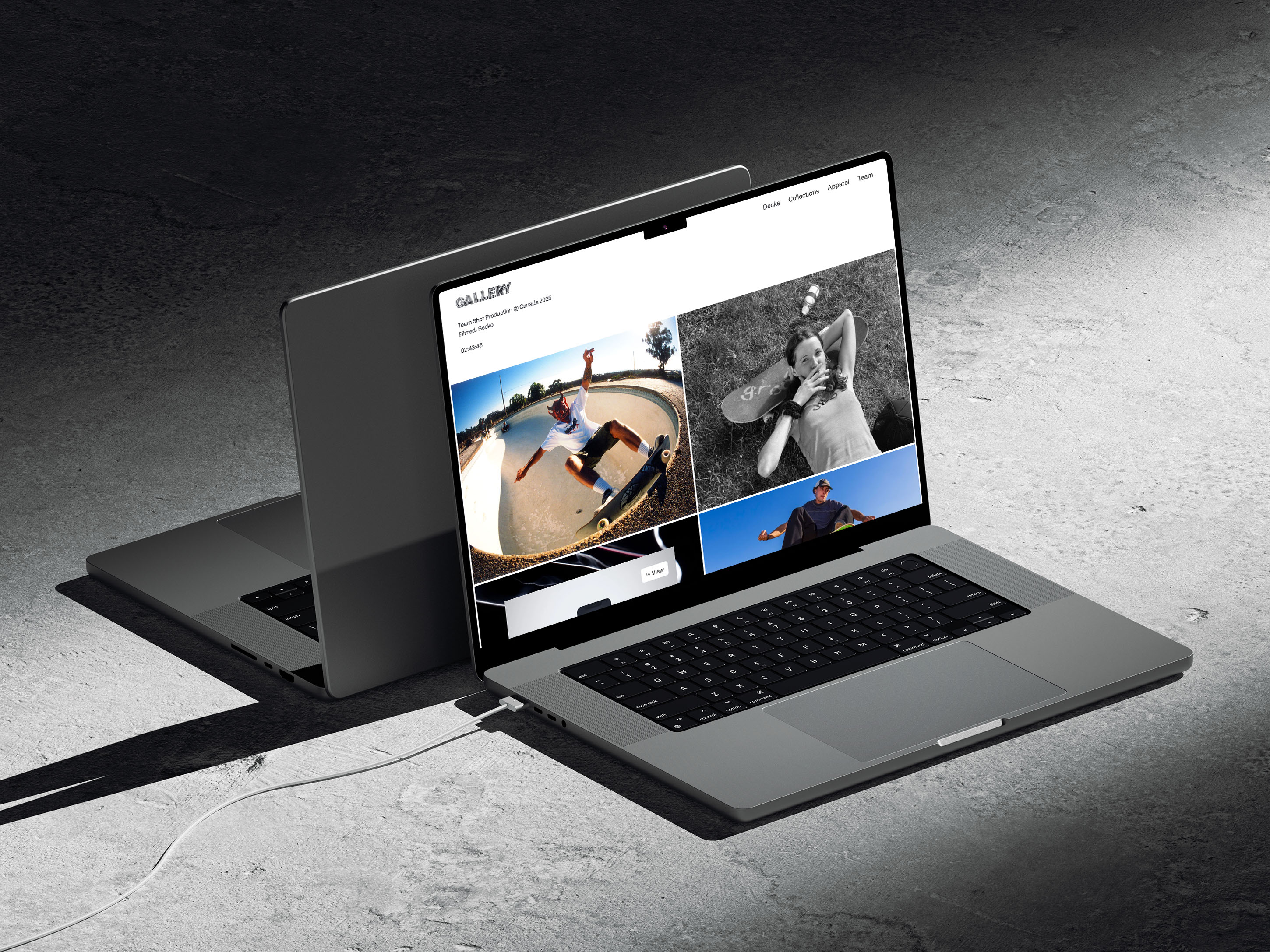
Seek Skateboarding
Revitalizing a discontinued skateboarding company through the development of a new brand direction.
Year
2024
Scope
Branding
Duration
1 Month
The goal was to transform a brand identity that lacked clarity and direction into a cohesive visual language that captured the raw spirit and creative side of skateboarding. Seek aims to celebrate skateboarding as both an art form and a lifestyle, emphasizing authenticity, self-expression, and original artwork through a brand built around the culture and community it represents.
Challenge
Seek was founded in 2002 by Rob Dyrdek and Josh Kalis as an offshoot of Alien Workshop, creating a more focused identity for a growing team of skateboarders. Its name paid homage to Alien Workshop's philosophy of seeking truth while establishing a separate brand direction. However, its identity lacked clarity, drawing from conflicting influences of international culture and hip-hop without establishing a cohesive visual or conceptual direction.
I was tasked with resolving these inconsistencies and developing a cohesive brand identity that could revive a skateboarding company with an established history, talented team, and limitless potential.
Research + Process
As a longtime skateboarder and admirer of the artwork and visual culture surrounding the industry, my research was guided by influences such as Ed Templeton and Toy Machine. I was particularly interested in understanding how illustration could become the foundation of an entire branding system rather than simply an additional graphic element. My approach focused on developing a more distinctive and expressive identity through a recognizable illustrated icon and a clearer visual direction. The logo took inspiration from navigation and compass imagery, incorporating an eyeball as its fourth point to connect the ideas of seeking skateboarding, creative expression, and new artistic endeavors. This concept carried throughout the identity, with a floating eyeball character and Seek's red, white, and black palette serving as recognizable elements across the brand.
Takeaway
This project allowed me to experiment not only with creating a new branding system, but also with building upon an existing identity within an established industry. Working with a brand that already had a place in skateboarding challenged me to identify what was missing, reconsider its visual direction, and develop ways to improve upon something that already existed in a highly competitive market. It reinforced the importance of understanding an industry's visual language while finding opportunities to introduce a fresh perspective.